


Your registration page is often the first real impression a clinician has of your organization. It is where they decide whether your event is worth their time, their money, and their CE hours. Today we are excited to share a fresh look for CE-Go registration pages, designed to work harder for both the organizations that host events and the attendees who sign up for them.
A page that feels like yours
The new design lets your brand lead. Your logo, colors, and tone carry through the whole page, so a webinar series, a single-speaker event, and an in-person summit each look like they belong to your organization. As the screenshots below show, the same layout adapts to very different brands and event types.
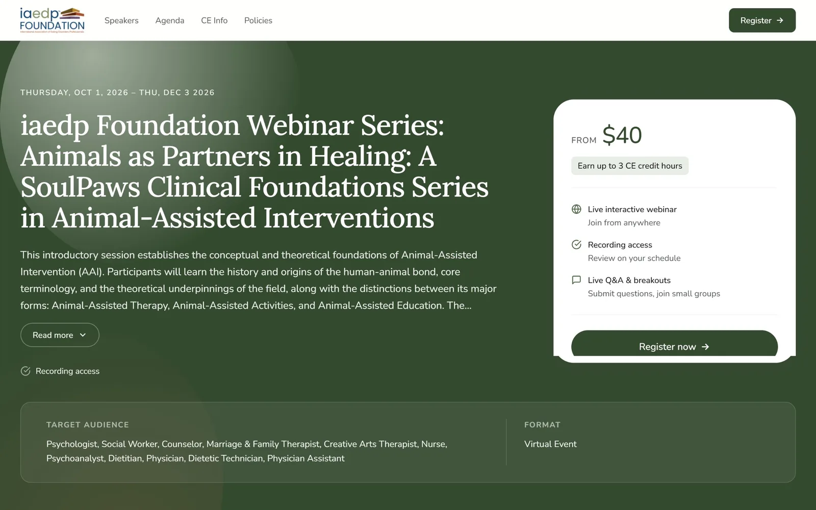
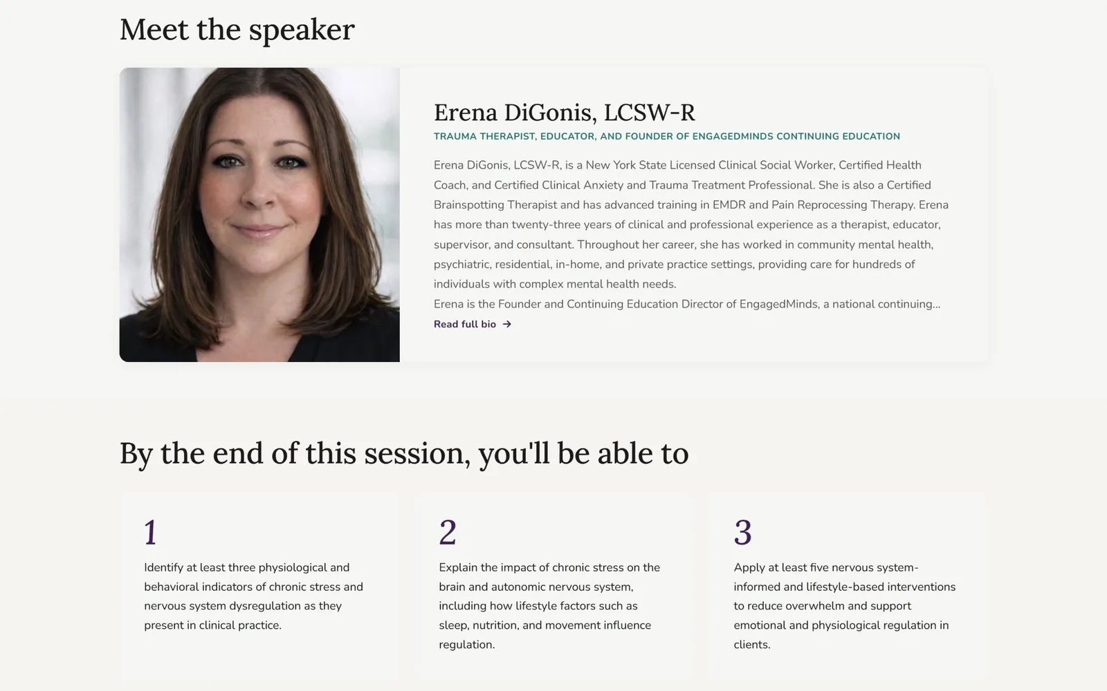

Everything attendees need, in the order they need it
We designed the page around the questions people ask before they register:
For in-person events, attendees also get venue details and directions. For multi-session events and conferences, the agenda is front and center.
Built for organizations, too
For event hosts, a clearer page means fewer questions in your inbox and more confident registrants. Because CE information is part of the page itself, your compliance details are visible from the first scroll. Paid or free, one session or fifty, the same polished layout scales with your event. And you do not have to design anything. Your page is ready to share the moment your event is published.
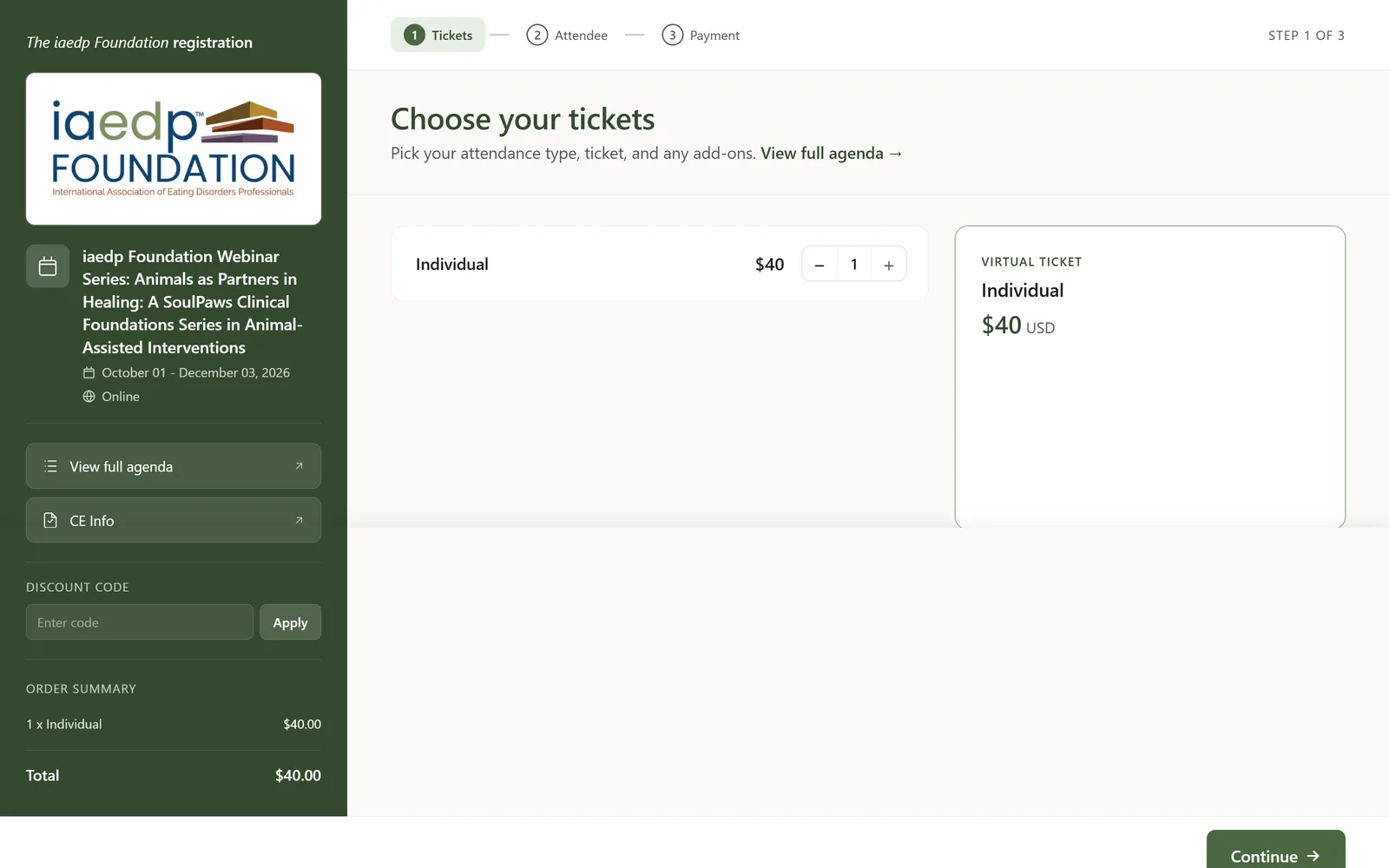
A simpler path to checkout
Registration is now a clean three-step flow: choose tickets, add attendee details, and pay. An order summary stays visible the whole time, along with the event details and a spot for discount codes. Attendees always know where they are and what they are paying.
Part of the CE-Go experience you already know
The new registration pages work with the tools CE-Go organizations already use, including Attendee Dashboards, automated evaluations and certificates, Zoom integration, and our Account Management and support teams. Nothing about your workflow has to change.
See it for yourself
The new registration pages are available now. If you are already a CE-Go organization, your upcoming events will show the new look. If you are curious how CE-Go could support your next webinar, conference, or in-person training, we would love to show you around. Schedule a demo with us today!


